
Wednesday 16 October 2013
Tuesday 15 October 2013
Title Block Design Options
Below are 4 options for the design of the title block for my music magazine:


All 4 of the designs are different in terms of the style but I feel they all have some link to the genre of my magazine. I wanted the colour of my title block to be black as I feel it coincides with the genre of my magazine.
Title Block Analysis

I
think the genre is pop due to the design of the title block. It looks young and
fresh which relates to the target audience.
With red
being the main colour, it reflects on the type of artists that are involved in
the magazine. Red is a bold, striking colour which means that the artists
involved in the magazine are popular and mainstream.
The way the
title block has been designed is similar to the way American jock uniforms are
designed. So with that being said, the target audience for the magazine would
be teenagers, starting from the age of 16.

I think the genre is popular music because ‘Q’ has another connotation of ‘que’
which means to wait in line. So if you were to put these definitions together
then it can be suggested that the magazine may deliver new up to date music and
releases of new albums, songs, etc without the need for people to wait for
visual adverts, i.e. television.
With red being the main colour, it reflects
on the type of artists that are involved in the magazine. Red is a bold,
striking colour which means that the artists involved in the magazine are
popular and mainstream.
So in terms of the genre, we can say
that the target audience would be between the ages of 16-25 as that is the age
group who relate to the genre. However, as the magazine talks about other things
such as, gig reviews and live concerts it could also appeal to those of an
older nature.

Due to the Rolling Stone being the name of a mainstream
band in the 60s, from that you can tell that the music genre of the magazine
would also be mainstream rock.
The boldness of the red used highlights the fact that the
music genre of the magazine is rock. It comes across as strong which could
reflect on the type of artists that appear in the magazine.
Due to the name of the magazine, I would feel
that the target audience age-wise would be those who were born around the 60s.
Also those who are into rock would be the target audience for the magazine as
the music genre for the magazine is rock. However, it doesn't mean that the
artists that appear in the magazine are all from the 60s or fit into the rock
genre category. For example, one issue had Lil Wayne who was not around in the
60s and doesn't do rock. So based on all this, I would feel the target audience
would be for those from the age 16 and above as they are the ones who would buy
music magazines and would be interested in finding out more about their
favourite artists.
Monday 14 October 2013
Final Proposal and Audience Profile
FINAL PROPOSAL
Below is the final proposal for my music magazine. I have answered a range of questions which will help people understand what my magazine will be about.

Thursday 10 October 2013
Evolution of Britney Spears Analysis
Analysing the different cover issues of Britney Spears
helped me understand how a person can be portrayed based on the angling of the
camera, the lighting, the person’s facial expressions as well as their costume.
It made me think about how I want the cover star of my magazine to be portrayed
as well as the portrayal of my magazine.
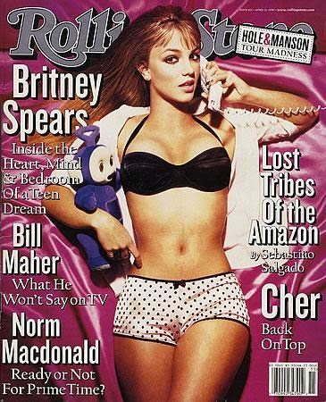
The image angle is a bird’s eye view. You can tell
this as she appears to be lying on a bed and in order to get the image taken
while she’s lying on the bed in to take a bird’s eye view shot. With this shot,
you can see most of Britney’s body, along with a costume, the props used and
the pink bed spread that she is lying on.
Britney is wearing her lingerie which consists of her
underwear and bra and she has a white school shirt on which is unbuttoned and
opened so you can see her bra and her toned body. Her underwear and her bra
contrast in terms of representation as the black bra gives of a more mature
representation whereas the underwear reminds people that she is still young. The
picture suggests that she is trying to provoke a sexual reaction from the
audience as she is not fully clothed. This image will be appealing to the male
audience as they picture was obviously taken this way to get men to like her.
However, females, especially teenage girls, might also use this image as a body
inspiration. As Britney was 17 years old when the picture was taken, they might
aspire to that body as she is of similar ages to teenagers and as she is in the
public eye.
The props used in the image are a teletubies teddy
which she is holding. This prop tells people that she is still young as
teletubies is associated with a kids television programme. The telephone that
she is holding up to her ear in the other hand however conveys a different
message to the audience. Her mouth is opened which again shows she’s trying to
be sexy.
The setting of this image is on a bed with a silk,
pink bed sheet. This connotes a sexual image to the audience.
Men would be attracted sexually to this image whereas
females would be envious Britney is young, beautiful and she has a body that
most females would aspire to have.
The black bra compliments the polka dots on her
underwear. Some fashion experts say a woman wearing black implies submission to
men, which would make sense as she is dressed and is posing this way to a get a
reaction from men rather than females. The
white on the school shirt she’s wearing symbolises innocence and purity which
contrasts the way she is being represented through the rest of her outfit. The
pink on the bed sheets represents romance and charm. It may also convey
playfulness or tenderness. This colour is commonly preferred by young girls to
show that they tender and soft.

Britney
is less than half naked. She is wearing white underwear with a pink lining and
is covering her chest with a sheet. In this image she is trying to get intimate
with the reader.
She’s in a closed room, which adds to the intimacy of
the shot.
The high key lighting makes the picture more honest
which adds to the intimacy.
The only colour used is white (and the pink on her
underwear lining). The white symbolises innocence and purity. The little pink
used represents romance and charm. It may also convey playfulness or
tenderness.
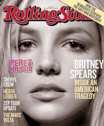
The
use of black and white is useful as it shows the emotions on her face and makes
her look innocent. The image is in low key lighting which makes the image
appear dramatic and conveys a lot of atmosphere and tension which is reflected
through the text alongside the image which says ‘BRITNEY SPEARS INSIDE AN
AMERICAN TRAGEDY’.
Britney wants a close relationship with the audience
and is shown through the close up of her face. She’s baring her emotions to the
audience so they can understand how she’s feeling with everything that’s
happened to her.
Tuesday 8 October 2013
Focus Group and Response
Below is a video of the focus group that I recorded. I asked the focus group questions that I am going to take into consideration when it comes to producing my magazine. With my focus group within my target audience age range, it means the feedback they give me on my magazine plan will help me to attract my audience even more.
The focus group told me that setting the price at £2.50 and making the magazine a weekly release was to expensive especially because of my target audience being teenagers. They said I should either lower my price or extend the issue release. Due to this feedback, I am considering to change my magazine release to either a fortnight release or a monthly release.
The focus group told me that setting the price at £2.50 and making the magazine a weekly release was to expensive especially because of my target audience being teenagers. They said I should either lower my price or extend the issue release. Due to this feedback, I am considering to change my magazine release to either a fortnight release or a monthly release.
Thursday 3 October 2013
Audience Questionnaire and Results

The question ‘what gender are you’ has given me the
information that I shouldn’t produce my magazine towards a specific gender as
there have equal amounts of responses from both males and females. Producing my
magazine this way will increase my target audience and allow both males and females to read my magazine.


From this question, I can design my magazine towards a
specific music genre. For example, RnB, Rock and Indie were the 3 popular music
genres that my respondents listened to. Using this information, I will include
articles and stories that involve artists from within these music genres. However, it doesn’t mean that I can’t use any of the other
genres as the options that I had given are popular music genres and none of my
respondents had selected the ‘other’ option which means these genres are
popular within my respondents.


Most people from my respondents don’t read music magazines
but there was only a difference of two. I can use this information to attract
readers to my magazine by making it more eye-catching and make sure there is
something for everyone in the magazine. With more people not reading music magazines, I can at least produce my magazine on more platforms than a magazine. I can make my magazine accessible online and on an app as well.

Kerrang was the most popular music magazine read by my
respondents. I have to make sure I include something for those who like the
rock genre as Kerrang is a rock magazine which was the popular option and also
rock was one of the top three music genres listened to by my respondents.

‘Artist on the front cover’ is what attracts my respondents
to a magazine the most. I have to make sure that when I am designing my front cover,
I have to include an artist(s) that is currently big in the charts or popular
within the music industry or someone who is up and coming into the industry.
‘Free goods’ was also popular along with ‘design &
layout’ so I have to enforce these options in the magazine somehow. E.g. if I
was to put an up and coming artist on the front cover of the magazine, I could give
the readers a free CD which would attract readers to reading my magazine and
also promote the artist at the same time so they would have more of a
listening/fan base.
The design & layout of my magazine must stand out to my audience and attract them to reading it. I have to make sure I don't go overboard with the colours and make sure the font is readable and doesn't cheapen my magazine.
The design & layout of my magazine must stand out to my audience and attract them to reading it. I have to make sure I don't go overboard with the colours and make sure the font is readable and doesn't cheapen my magazine.

A monthly issue was the most popular option from my respondents. So if I was to make my magazine a monthly issue I would have to include a lot of articles and stories, etc. to make sure that my readers keeping reading my magazine every month.
However a weekly issue was the second popular option and if I was to make my magazine a weekly issue, I would be able to include all the latest stories and trends which will keep my readers hooked onto my magazine, which will make them more eager to read my magazine every week.

£1-£2 and £2-£3 were the popular options but the price of
the magazine will depend on how often the magazine would be released. If the
magazine was to be a monthly issue, I would charge my readers around £3-£4. If
the magazine was to be a weekly issue then I could charge my readers around
£2-£3. The price would also depend on how much things would be included in the
magazine. But also the price I end up making my magazine will have to coincide with my taget audience. As my target audience is between 16-24, I have to make it afforable as majority of them would be students and so wouldn't have the budget to afford paying more than £4 for an issue.

‘Interviews with artists’ was the popular option form my
respondents. In order to find out what artists my readers would want to be
interviewed, I would include a twitter account (which is one the popular social
media sites currently) and allow the readers to tweet me their answers so I
know who my readers like and so I don’t waste my time and their time with an
interview people don’t want to know about.
Looking at the responses to the question, I think I would
use all these options in the magazine as they seem to be wanted by the respondents
and also enforcing these in my magazine will gain me more readers as there
would be something for everybody.

Most of my respondents want the magazine to be accessed
online which I would do so my magazine can be accessed on different platforms. Also, with my magazine being accessed online, it means that my audience will be getting the latest information in the music and won't have to wait weekly or monthly for the magazine issue.
Tuesday 1 October 2013
Initial Magazine Plan
Below is a screen shot of the plan for my magazine. As you can see, I have thought about what I want in my magazine but I haven't been able to decide on the price I am going to set for it. I am going to ask my focus group what price out of the options below would be better for my magazine and decide on from then.

Magazine Institution Research
Below is a power-point of the research I have done on Bauer Media Group, IPC Media, Immediate Media and Development Hell Limited. This research was helpful as it would help to decide which institution will publish the magazine I'm going to produce.
Subscribe to:
Posts (Atom)