
Sunday, 22 December 2013
Friday, 20 December 2013

Thursday, 19 December 2013


Monday, 16 December 2013
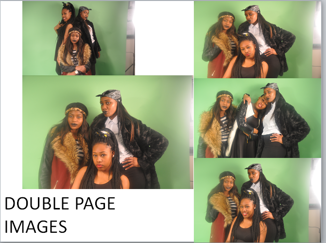
Chosen Front Cover and Double Page Images
 |
| The reason why I chose this image to be on the front cover is because out of the other images I had taken for the front cover, this was the one image where the girls were pouting correctly and were standing in a way that makes them come across strong and confident. I felt their eyes in the other pictures were squinting at times as well. |
 |
| I feel this image is a more relaxed image of them, especially with one of the girls leaning on the other girl's shoulder. It's more comfortable which makes the readers feel at ease with them. The image is more relaxed because of the girl smiling as well as her resting her head. |
 |
| I decided to use this image for the double page as well as the above image because this image sums the girls up. The image shows both personalities; they can be relaxed and act like teenage girls (which they are) and they can also be serious (which they have to be when they're in work mode). |
Thursday, 12 December 2013

Wednesday, 11 December 2013
Photograph Planning
When it came to deciding location shots, I wanted there to be a plain background so it doesn't the distract the reader away from the main artists on the front cover. So in a classroom, I set up a green screen and got my main artists to pose in front of it so when that when it comes to editing I can play about with different background colours.
With props, I didn't want there to be a lot of them around within my shots. The less things going on in the image, the more attention there will be on the artists themselves. The only prop that I used was a chair which one of the girls from the main cover was sitting on on the picture used in the double page article.
When it came to deciding who I wanted to be artists on my magazine, I had to make sure they looked the right part. I asked for them to dress according to the type of artists I wanted them to be. With the boys, (Tristan, Michael, Fela) I didn't want them to look like how typical young, black boys would look so I wanted them to dress smart casual but I wanted them to enforce some youth into their image as I still wanted them to fit in within my target audience age range. The adding of the snapback and the bomber jackets I feel made them look their age. When it came to the girls, I wanted different looks for them all. On the contents page, I wanted the single girl (Stephanie) to look sexy but without the need for revealing clothes. I wanted her stand out as those girls that doesn't use their body to grab the attention of the audience. The use of direct mode address I felt would be enough for the type of artist I wanted her to be. When it came to the girl group, I wanted them to dress their age and look stylish. I wanted them to incorporate the current trend in the fashion world within their age range. For the main artists (Sarah, Bukola, Hannah), I wanted them to look sexy but also look confident. When it came to the clothing of them, I didn't want them to dress how girls in the music industry typically dress. I wanted them to look sexy fully clothed but draw the readers in through their eyes. The slight squint in some of their eyes and the pouting of their lips will give them attitude.
The media equipments being used are a digital camera so I can take good quality pictures and also view my pictures after I've taken them so I can decide whether or not I need to take more or improve on that particular shot. Along with the green screen, I used lighting so the girls can stand out more on the page of my front cover. Some of the shots taken were taken on the camera stand so I could get a clear, straight picture of my artists.
Monday, 9 December 2013
Peer Assessment

This peer assessment was done by Sage. He gave me a generous mark as I feel my magazine still has a lot of work to do. I am going to enforce some of his improvements such as buzz words and the re-positioning of the title block. In terms of the contents page, I am going to align the articles. Graphic features are also something I would include as I could place the buzz words on the graphic feature making them stand out on the page.

This peer assessment was done by Joseph. He gave me a lot of constructive criticism which I am going to enforce such as the slogan for the magazine and adding text alongside the artist names on the front cover so the reader knows what article about the artist is. From what his evaluation is telling me, my front cover needs more work than my contents page as the front cover is obviously going to be the first thing that the audience will see and so the front cover needs to look attractive and eye-catching. I feel Joseph's feedback will help bring that attraction.
Thursday, 28 November 2013
Original Article Draft
The UK’s answer to Destiny’s Child; Sarah, Hannah &
Bukola or Ebony Align, as they’re known by their fans, have had a whirlwind of
a year. Slowly they’re making a big impact in the music industry, here’s their
exclusive interview with BEATS on all things Ebony.
Your career is going
from strength to strength. You've recently finished your summer festivals from Reading
Festival to Glastonbury and your first single has gone to number one. Did you
ever imagine any of this happening to you?
Sarah: No way! Never in a million years!
Hannah: We literally sang together to have fun, we never
thought that we would sing for a career.
Bukola: We were preparing for our A-Levels and were planning
to go down the academic route and go onto university. Becoming a girl group was
never our initial plans.
What made you decide
to become a girl group?
Bukola: My uncle is a small time producer and when he heard
us singing he thought we had something that should be heard on a bigger
platform. He encouraged us to upload
videos of us singing online and from there that’s how people started to know
who we are. We sing covers of other artists’ songs but we would put our stamp
on it by maybe adding some rap into it our changing the words so we can sing
the song as if it was personal. Our current record label came across us on the
internet and wanted to hear us out and see if we could make a career out of it.
Sarah: I thought A-Levels were scary but that was the
scariest thing ever. We didn't want to embarrass ourselves so we put our all
into that.
Hannah: We’re grateful that someone saw something in us.
How do you feel being
called ‘the UK’s Destiny’s Child’?
Sarah: When we sang we would think we were Destiny’s Child.
I was always Beyoncé [snaps fingers and laughs].
Bukola & Hannah: [shouts] I was Kelly!
Hannah: No I was Kelly; I've got the short hair!
Bukola: The amount of times we've argued about this is
actually hilarious.
Sarah: I think we are similar to Destiny’s Child in a way.
They had a strong ethos for female power and independency and that is what we
want to represent. We want to be the logo for female power because we have a
first-hand understanding of the struggles females go through.
What do you mean by
that?
Sarah: We've been raised by single mothers with no male
adult role model and we know we’re not the only ones that have been raised
under these circumstances.
Bukola: Our mothers had to support us financially and
emotionally as well as themselves in order for us to have a good life.
Hannah: We owe our mothers everything.
Do you like the way
female artists are being presented in the media industry?
Sarah: Personally I feel that female artists shouldn't feel
the need to wear minimal clothing in order to be noticed or in order to get
attention.
Bukola: Music should be about the lyrics and the meaning
behind it and not what a person wears.
Hannah: Plus I don’t think our mothers will let us parade
around in our birthday suit [laughs].
How would you
describe your clothing style?
Sarah: We've
grown up wearing high street clothing. So we usually tend to shop in places
such as Topshop, New Look, River Island, etc.
Bukola: We’re
all about the fur and bandannas, especially Hannah.
Hannah:
Don’t hate, appreciate! Anyway, aside from that, [rolls eyes at Bukola] if it’s
casual the denim jeans and trainers are out. But when we've got a reason to
dress best believe we go all out. The heels, the hair, the make-up, everything;
we don’t mess about. [All laugh]
If you could have any
career aside from singing, what would it be and why?
Bukola: I've always been interested in criminology. I had a
phase where I would constantly watch all the CSI’s so CSI New York, CSI LA, CSI
Miami and CSI all of it. I feel like it’s a job that will never get boring because
of the types of cases you deal with. The final outcome, so when you discover
the cause death and paint a scenario for what’s happened, is always the most
intriguing because it makes you think how far people would go to end someone’s
life.
Hannah: I feel a bit boring saying my career choice. [Bukola
laughs] Well I've always enjoyed maths so I wanted to go into accounting and
finance but I'm not 100% sure because I don’t think I will be able to handle a
desk job. I can’t stand silence. I spent a week in Barclays Bank for work’s
experience and I swear the only voices I could hear were mine and my mentor’s.
I couldn't hack it.
Sarah: I'm the only one that still isn't sure what they want
do as a career. I don’t really have a strong subject where I would actually
want to take it that one step further. I would need to look at the options I
have and choose something that would seem like it would interest me. I never
really sat down and mapped out my future.
What can we expect
from your first album?
Sarah: We've been able to get collaborations with two big
names in the industry right now but we’re not allowed to say who. But what I
can say is that it was such a shock to think that these artists wanted to
collaborate with us because they have collaborated with a LOT of people in the
industry.
Bukola: Our album is full on R&B. It’s the genre we’re
familiar with, seeing as we've grown up with the genre of music playing around
us. We've got the slow jams going on and some upbeat songs which you can dance
to in the clubs.
Hannah: We've written 3 of our songs which are included in the
album and in the songs we talk about different things. There’s a song that’s
about the struggles single mothers have, which we feel a lot of people can
relate to because that’s how they grew up. We've got another song that is about
female independency and how women don’t need men. That’s kind of what we’re
representing as a group because we feel women objectify themselves to men when
they don’t need to. The other song that we wrote is one of the upbeat songs
which is basically saying forget about the stress from the week and turn up for
the weekend.
What is the biggest
thing you would like to happen to Ebony Align?
Hannah: I wouldn't mind having a sold arena concert because
at least then you know you've made it. I wouldn't mind having a sold out tour
but that’s just me being ambitious.
Sarah: I think making it in the states would be a massive
thing because of the fact not a lot of British acts make it. The biggest
current one I can think of is One Direction but when it comes to female girl
groups, I don’t think any has anything like that but they are getting there
slowly. I think America needs us to be honest.
Bukola: To still be in the industry in say 10-15 years and
to have a global fan base would be amazing.
What can we expect
from Ebony Align in the future?
Hannah: We’re going to going around the country to do some appearances to promote our new
single ‘Hear Me’ then in March 2014 we’re going to have our first tour hitting
all the major cities around the country.
Sarah: We’re really excited for it all.
Bukola: We hope all our fans come to see us during our tour.
Monday, 25 November 2013


Monday, 11 November 2013
Plan For Artist
·

The artist that will appear on the front
cover of my magazine is a girl group called Ebony Align.
· They’re from East London. These girls were raised by single mothers and looked up to their mothers for what they have done for them and for what they have given up for them.
·
They represent girl power and feel that
women shouldn't subject themselves to men. They want to make a difference to all females and make them feel empowered and that they can do anything they put their mind to.
·
They don’t believe that they should gain
media attention through the lack of clothes they wear but through the actual
lyrics and what they represent.
·
They will challenge the stereotype of female artists in the music industry due to what they wear, what they represent and what they sing about.
They will challenge the stereotype of female artists in the music industry due to what they wear, what they represent and what they sing about.
Thursday, 7 November 2013
Front Cover Mood Board Analysis
This is an analysis of the mood board I created. The mood board consists of different magazine covers that are based on RnB and Hip Hop.

Wednesday, 16 October 2013

Tuesday, 15 October 2013
Title Block Design Options
Below are 4 options for the design of the title block for my music magazine:


All 4 of the designs are different in terms of the style but I feel they all have some link to the genre of my magazine. I wanted the colour of my title block to be black as I feel it coincides with the genre of my magazine.
Title Block Analysis

I
think the genre is pop due to the design of the title block. It looks young and
fresh which relates to the target audience.
With red
being the main colour, it reflects on the type of artists that are involved in
the magazine. Red is a bold, striking colour which means that the artists
involved in the magazine are popular and mainstream.
The way the
title block has been designed is similar to the way American jock uniforms are
designed. So with that being said, the target audience for the magazine would
be teenagers, starting from the age of 16.

I think the genre is popular music because ‘Q’ has another connotation of ‘que’
which means to wait in line. So if you were to put these definitions together
then it can be suggested that the magazine may deliver new up to date music and
releases of new albums, songs, etc without the need for people to wait for
visual adverts, i.e. television.
With red being the main colour, it reflects
on the type of artists that are involved in the magazine. Red is a bold,
striking colour which means that the artists involved in the magazine are
popular and mainstream.
So in terms of the genre, we can say
that the target audience would be between the ages of 16-25 as that is the age
group who relate to the genre. However, as the magazine talks about other things
such as, gig reviews and live concerts it could also appeal to those of an
older nature.

Due to the Rolling Stone being the name of a mainstream
band in the 60s, from that you can tell that the music genre of the magazine
would also be mainstream rock.
The boldness of the red used highlights the fact that the
music genre of the magazine is rock. It comes across as strong which could
reflect on the type of artists that appear in the magazine.
Due to the name of the magazine, I would feel
that the target audience age-wise would be those who were born around the 60s.
Also those who are into rock would be the target audience for the magazine as
the music genre for the magazine is rock. However, it doesn't mean that the
artists that appear in the magazine are all from the 60s or fit into the rock
genre category. For example, one issue had Lil Wayne who was not around in the
60s and doesn't do rock. So based on all this, I would feel the target audience
would be for those from the age 16 and above as they are the ones who would buy
music magazines and would be interested in finding out more about their
favourite artists.
Monday, 14 October 2013
Final Proposal and Audience Profile
FINAL PROPOSAL
Below is the final proposal for my music magazine. I have answered a range of questions which will help people understand what my magazine will be about.

Thursday, 10 October 2013
Evolution of Britney Spears Analysis
Analysing the different cover issues of Britney Spears
helped me understand how a person can be portrayed based on the angling of the
camera, the lighting, the person’s facial expressions as well as their costume.
It made me think about how I want the cover star of my magazine to be portrayed
as well as the portrayal of my magazine.

The image angle is a bird’s eye view. You can tell
this as she appears to be lying on a bed and in order to get the image taken
while she’s lying on the bed in to take a bird’s eye view shot. With this shot,
you can see most of Britney’s body, along with a costume, the props used and
the pink bed spread that she is lying on.
Britney is wearing her lingerie which consists of her
underwear and bra and she has a white school shirt on which is unbuttoned and
opened so you can see her bra and her toned body. Her underwear and her bra
contrast in terms of representation as the black bra gives of a more mature
representation whereas the underwear reminds people that she is still young. The
picture suggests that she is trying to provoke a sexual reaction from the
audience as she is not fully clothed. This image will be appealing to the male
audience as they picture was obviously taken this way to get men to like her.
However, females, especially teenage girls, might also use this image as a body
inspiration. As Britney was 17 years old when the picture was taken, they might
aspire to that body as she is of similar ages to teenagers and as she is in the
public eye.
The props used in the image are a teletubies teddy
which she is holding. This prop tells people that she is still young as
teletubies is associated with a kids television programme. The telephone that
she is holding up to her ear in the other hand however conveys a different
message to the audience. Her mouth is opened which again shows she’s trying to
be sexy.
The setting of this image is on a bed with a silk,
pink bed sheet. This connotes a sexual image to the audience.
Men would be attracted sexually to this image whereas
females would be envious Britney is young, beautiful and she has a body that
most females would aspire to have.
The black bra compliments the polka dots on her
underwear. Some fashion experts say a woman wearing black implies submission to
men, which would make sense as she is dressed and is posing this way to a get a
reaction from men rather than females. The
white on the school shirt she’s wearing symbolises innocence and purity which
contrasts the way she is being represented through the rest of her outfit. The
pink on the bed sheets represents romance and charm. It may also convey
playfulness or tenderness. This colour is commonly preferred by young girls to
show that they tender and soft.

Britney
is less than half naked. She is wearing white underwear with a pink lining and
is covering her chest with a sheet. In this image she is trying to get intimate
with the reader.
She’s in a closed room, which adds to the intimacy of
the shot.
The high key lighting makes the picture more honest
which adds to the intimacy.
The only colour used is white (and the pink on her
underwear lining). The white symbolises innocence and purity. The little pink
used represents romance and charm. It may also convey playfulness or
tenderness.

The
use of black and white is useful as it shows the emotions on her face and makes
her look innocent. The image is in low key lighting which makes the image
appear dramatic and conveys a lot of atmosphere and tension which is reflected
through the text alongside the image which says ‘BRITNEY SPEARS INSIDE AN
AMERICAN TRAGEDY’.
Britney wants a close relationship with the audience
and is shown through the close up of her face. She’s baring her emotions to the
audience so they can understand how she’s feeling with everything that’s
happened to her.
Tuesday, 8 October 2013
Focus Group and Response
Below is a video of the focus group that I recorded. I asked the focus group questions that I am going to take into consideration when it comes to producing my magazine. With my focus group within my target audience age range, it means the feedback they give me on my magazine plan will help me to attract my audience even more.
The focus group told me that setting the price at £2.50 and making the magazine a weekly release was to expensive especially because of my target audience being teenagers. They said I should either lower my price or extend the issue release. Due to this feedback, I am considering to change my magazine release to either a fortnight release or a monthly release.
The focus group told me that setting the price at £2.50 and making the magazine a weekly release was to expensive especially because of my target audience being teenagers. They said I should either lower my price or extend the issue release. Due to this feedback, I am considering to change my magazine release to either a fortnight release or a monthly release.
Thursday, 3 October 2013
Audience Questionnaire and Results

The question ‘what gender are you’ has given me the
information that I shouldn’t produce my magazine towards a specific gender as
there have equal amounts of responses from both males and females. Producing my
magazine this way will increase my target audience and allow both males and females to read my magazine.


From this question, I can design my magazine towards a
specific music genre. For example, RnB, Rock and Indie were the 3 popular music
genres that my respondents listened to. Using this information, I will include
articles and stories that involve artists from within these music genres. However, it doesn’t mean that I can’t use any of the other
genres as the options that I had given are popular music genres and none of my
respondents had selected the ‘other’ option which means these genres are
popular within my respondents.


Most people from my respondents don’t read music magazines
but there was only a difference of two. I can use this information to attract
readers to my magazine by making it more eye-catching and make sure there is
something for everyone in the magazine. With more people not reading music magazines, I can at least produce my magazine on more platforms than a magazine. I can make my magazine accessible online and on an app as well.

Kerrang was the most popular music magazine read by my
respondents. I have to make sure I include something for those who like the
rock genre as Kerrang is a rock magazine which was the popular option and also
rock was one of the top three music genres listened to by my respondents.

‘Artist on the front cover’ is what attracts my respondents
to a magazine the most. I have to make sure that when I am designing my front cover,
I have to include an artist(s) that is currently big in the charts or popular
within the music industry or someone who is up and coming into the industry.
‘Free goods’ was also popular along with ‘design &
layout’ so I have to enforce these options in the magazine somehow. E.g. if I
was to put an up and coming artist on the front cover of the magazine, I could give
the readers a free CD which would attract readers to reading my magazine and
also promote the artist at the same time so they would have more of a
listening/fan base.
The design & layout of my magazine must stand out to my audience and attract them to reading it. I have to make sure I don't go overboard with the colours and make sure the font is readable and doesn't cheapen my magazine.
The design & layout of my magazine must stand out to my audience and attract them to reading it. I have to make sure I don't go overboard with the colours and make sure the font is readable and doesn't cheapen my magazine.

A monthly issue was the most popular option from my respondents. So if I was to make my magazine a monthly issue I would have to include a lot of articles and stories, etc. to make sure that my readers keeping reading my magazine every month.
However a weekly issue was the second popular option and if I was to make my magazine a weekly issue, I would be able to include all the latest stories and trends which will keep my readers hooked onto my magazine, which will make them more eager to read my magazine every week.

£1-£2 and £2-£3 were the popular options but the price of
the magazine will depend on how often the magazine would be released. If the
magazine was to be a monthly issue, I would charge my readers around £3-£4. If
the magazine was to be a weekly issue then I could charge my readers around
£2-£3. The price would also depend on how much things would be included in the
magazine. But also the price I end up making my magazine will have to coincide with my taget audience. As my target audience is between 16-24, I have to make it afforable as majority of them would be students and so wouldn't have the budget to afford paying more than £4 for an issue.

‘Interviews with artists’ was the popular option form my
respondents. In order to find out what artists my readers would want to be
interviewed, I would include a twitter account (which is one the popular social
media sites currently) and allow the readers to tweet me their answers so I
know who my readers like and so I don’t waste my time and their time with an
interview people don’t want to know about.
Looking at the responses to the question, I think I would
use all these options in the magazine as they seem to be wanted by the respondents
and also enforcing these in my magazine will gain me more readers as there
would be something for everybody.

Most of my respondents want the magazine to be accessed
online which I would do so my magazine can be accessed on different platforms. Also, with my magazine being accessed online, it means that my audience will be getting the latest information in the music and won't have to wait weekly or monthly for the magazine issue.
Tuesday, 1 October 2013
Initial Magazine Plan
Below is a screen shot of the plan for my magazine. As you can see, I have thought about what I want in my magazine but I haven't been able to decide on the price I am going to set for it. I am going to ask my focus group what price out of the options below would be better for my magazine and decide on from then.

Magazine Institution Research
Below is a power-point of the research I have done on Bauer Media Group, IPC Media, Immediate Media and Development Hell Limited. This research was helpful as it would help to decide which institution will publish the magazine I'm going to produce.
Friday, 20 September 2013
Double Page Spread Analysis (NME magazine)


The article
is almost educating the reader as they are being told about the artist’s life
and how she’s developed because of that. The reader has been told about her
upbringing and how difficult that has been for her as no child should have to
go through what she has been through. However
the language used doesn’t make the story negative but a positive as the artist
has become a better person because of her life experiences.
A standard
colour of black has been used, which allows the reader to not get distracted by
many colours and allows them to concentrate on the article. However there are a
few uses of red which contrasts the colour scheme and stand out. The red could
connote passion, which is shown throughout the article.
A standard
font has been used which makes the article readable and doesn’t cheapen the
magazine with unnecessary styles of fonts. It also allows the reader to focus on the article and connect to what the artist is saying.
The first
page of the double page spread has an image of the artist, and the
second page has the actual article.
One page is taken up by an image of the artist and the other page is taken by the text from the article.
I feel the
magazine addresses the reader as a member of an ‘in’ crowd. It’s as if they are
inviting us to be a part of Angel Haze’s life as we go on this journey
throughout the article from when she was young and lived within a religious
cult and was a sexually abused, to her life on stage and the connection she has
with her fans, to when she is helping those people who have gone through what she
has been through or are going through it now. The magazine turns the artist’s
life into a positive and she has come out better on the other side and can
learn and grow from her life experiences and also used her experiences in her
lyrics.
The one
image that was used is a mid-shot of the artist accessorised with a Versace
chain, glasses and a black hat. As the artist is wearing glasses, we don’t
really know if she’s looking directly at the audience as we can’t see her eyes.
As an artist, she has put on a character which is shown through the image but
the background she has come from and the things that have happened her to have
no link. It’s as if she’s giving some sort of hidden message that you can go
through anything and still come out on top, which she is living proof of.
Both the
heading in the article and the text on the front cover of the magazine are
similar in the sense that the texts have both been written in bold and take up
a good amount of the page.
The article
gives a brief background of the artist and the life she lived when she was
younger and before she hit the spotlight and so demand for any prior knowledge isn't necessary. However, the reader might need some knowledge on religious cults and how that affects people. By doing this they can understand what she says in the article but it's not a necessity.
Wednesday, 18 September 2013
Front Cover Analysis (NME magazine)

The magazine is a music magazine. The front cover tells me that there is going to be lots of information about artists and the latest information surrounding their musical career along with interviews with artists.
The target
audience for the magazine would be those who are interested in the music
industry and want to find out what’s going on with an artist. Are they
releasing new music soon? Have they got a tour coming up? It would also be
males due to the design of the title block and the layout of the front cover.
The central image is
using direct mode of address, where the person in the image is looking straight at
the reader. The direct gaze helps simulate interaction with each individual
reader.
This tells
me that the artist on the front cover wants a close relationship with the reader.
Franz
Ferdinand is on the front cover and they have given their fans exclusive tracks
on a CD which has come with the magazine along with a track-by-track guide.
The
anchorage text says ‘Back with a bang’. This implies that Franz Ferdinand (the
band on the front cover) are re-entering the music industry with a big impact.
The overall
message the band is giving is that they are trying to say that their music is
going to be better than it has been and going to hit the industry hard.
‘Exclusive’
is a buzz word that was used on the front cover. This is telling the audience NME are the only
magazine that's going to be covering the story and so will make the reader more
interested to read it as they won’t be able to get the story from elsewhere.
However, on top of an exclusive interview, NME have also given their readers ‘exclusive
tracks and rarities’.
The title
block is the largest text on the front cover which has been designed big and
bold. The title block being designed like says that the magazine is quite
masculine and is aimed at men.
NME stands
for New Music Express which connotes that they have new news surrounding artists,
be it information about music releases or tour information. As the M in NME
stands for music, this means that their magazine isn't specific about the genre
of music they include in their magazine which makes it variable to readers and
attract a wider audience.
The main
font colours used are white, red and yellow. The colour background of the magazine
is white. Some of the texts have been written on top of blue and purple
background colours. The use of many colours brightens up the magazine making it
stand out in newsstands and not blend in with the other magazines. They
brighten up the magazine as well so it doesn't look dull and also makes it more
appealing to potential readers. Even though more than 3 colours have been used,
it doesn't look tacky as the colours used haven’t c lashed with each other but
instead complement each other. The colours used are neither feminine nor masculine.
This tells me that based on the colours used on the magazine; it isn't
specifically aimed at a particular gender even though it actually is aimed at
men. The font used is a standard font which makes the text clear and readable.
It also prevents the magazine from looking tacky. The magazine is eye-catching because
of the big fonts used.
Contents Page Analysis (NME magazine)

The magazine uses images and the images used in the contents coincide with the articles that are mentioned. For example, there is a picture of the artist Angel Haze, which tells the reader the article is going to be about her which is clarified with the very brief summary of her article headline underneath her picture.
The images used coincide with the articles involved so it doesn't really say much about its style however due to there being more male images than female and the audience for this magazine is males and so it supports my initial findings.
The colour of the text is black but the number pages have been coloured red. This use of colour technique makes it easier for the reader to find what it is they are looking for. It supports style of the front cover as the colours used in the contents page are used on the front page.
Different types of font have been used. There is a use of bold and standard font text used which helps differs each article from the other.
The contents page differs from the front cover in the sense that the front cover is big and bold and colourful as it should be as it has to attract readers but the contents page is a bit standard which helps the reader find the article they want to read without getting distracted with anything in the page or finding it difficult to find.
The page has been organised in 3 columns. The articles haven’t written in chronological order but are jumbled around. However, the size, colour and boldness of the article pages allow the reader to find the page they want as it is viewable. The main articles have images so the reader can know without reading who the article is about.
¾ of the page is taken up by the big article features and the other ¼ includes a promotional feature and a smaller contents page which includes extra things for the reader to do such as crosswords, reviews and gig guides. The sections that comes first on the contents page are those that are of most relevance to the magazine. The artists mentioned in the contents page also reinforce the genre of the magazine.
In the bottom right hand corner of the page, there is a red box that tells readers that they can ‘subscribe to NME today and save up to 38%’.
Tuesday, 17 September 2013
Conventions of a magazine cover
Below is an analysis of the magazine VIBE. In the analysis I talked about the main conventions of a magazine front cover and explained how affective they were in terms of attracting the target audience.

Thursday, 12 September 2013
Prelim: College magazine contents page
Below is the contents page of my college magazine. I thought carefully about what the readers would want within the content of the magazine and so put in things that I thought was key and was something that I thought the readers would be interested and would have found useful.
To create the contents page, I used Photoshop. I simply used an image that I had taken of a school playground and made it the background of the page. I thought it was best if the article names were placed down the middle of the page so it's in direct vision for the audience. I placed the other images and motivational words around the article names so it stands out.

To create the contents page, I used Photoshop. I simply used an image that I had taken of a school playground and made it the background of the page. I thought it was best if the article names were placed down the middle of the page so it's in direct vision for the audience. I placed the other images and motivational words around the article names so it stands out.

Tuesday, 10 September 2013
Prelim: College magazine front cover
As my magazine was based around school, I thought it would
be ideal to have a picture of a student as the central image of the magazine.
Even though the picture doesn't fit a typical school themed magazine, I thought
the image was the better option for the magazine so it doesn't put students of
from buying it. I thought it would be better if the central image was something
that would gain attention from readers and make them inclined to read the
magazine.
To construct the front cover, I simply used the image which I
had taken myself using a digital camera, and uploaded it onto the front cover which I was creating using Photoshop. Using Photoshop, allowed me to experiment with different
filters, font sizes and styles. I decided to go with a standard font style as I thought
if I was to go overboard with the different styles, it would cheapen my
magazine and potential readers wouldn't want to read my magazine.
 |
| The image on the front cover is a mid-shot picture of a student. The student in the picture goes to a sixth form which is shown through her smart dressing. |
Subscribe to:
Posts (Atom)